
“Puzzle Pieces” by Daniel P. Fleming is licensed under CC BY-SA 2.0
January goal: develop the introductory module and design the overall look of the website.
I started by creating a mini 10-page booklet of all the ‘requirements’ for my project according to my research. I also had 3 spreadsheets covering content, core competencies, and curricular competencies according to the BC Ministry guidelines. The BC big ideas were included on the content spreadsheet. As for IB MYP Key and Related Concepts and Statements of Inquiry, I am hoping to create those as I go along developing every task. Although MYP units should be 20 to 25 hours long, many of these unit tasks would not require that amount of work as I felt it would be unreasonable for 13 to 15 year old students to work for that long without reaching an endpoint. To keep motivation high and self-regulation easy, I thought I should aim for each task to take 3-8 hours, including shorter learning engagements including videos, articles, skill practice and other formative elements leading towards the summative task. That should be long enough to get some depth but short enough for students to see the end as achievable.
Starting to lay out the website, I affirmed that one of the reasons so many good resources require signing in or paying is that it is a huge job to create a good resource. It is not only the curating and creating of content, it also is the design of the physical website. In this case, there are so many elements needing linking to be transparent about BC ministry requirements, topics, and levels of mathematic proficiency according to Bloom’s taxonomy. I decided to use tags rather than develop a map of coverage. These tags are important for a teacher looking at the resource to see if it meets the BC requirements or for ideas to use in their own classroom, but the tags are unimportant for the student using the resource. I created tag pages which listed the requirements and the tag associated with it so that in the future, the tag could be linked to the page showing all the posts associated with a search for that tag.
I had an image in my mind of what I wanted the website to look like, but I also did not want to spend hours on creating it. I explored some of the plugins included in the WordPress site on The Open EdTech Collaborative site, opened.ca. Originally, I thought the main page for each area of mathematics explored would list all the information like a table of contents but in mind map form. With just the simple introductory module that I was using as a test, I realized the mind map for other modules would look terribly busy and therefore be a deterrent for students. I decided a post for each task would be a better design.
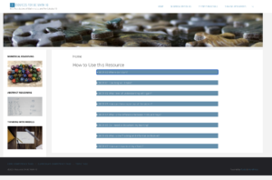
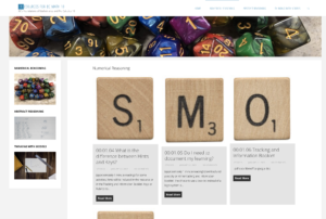
Images for the first 4 modules’ headers were chosen or taken and I experimented with layout for the introductory module. Although I planned on posts, I decided it would be better if the home page had the introduction elements. For some glitchy reason, the theme I chose wasn’t allowing accordions for this page, so I managed to add some CSS and code them in. I also decided that if I couldn’t sort out how to have a sidebar listing all the posts for only one module, that the sidebar would at least be pretty with the images chosen for the headers. Hopefully, in the future I would be able to create a submenu list of the posts when you hovered over the sidebar image.
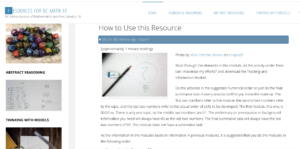
Next step, actually get Module 1, Numerical Reasoning done.


 Planning a wedding for my daughter and her partner and the limited Covid guest list was very different than the original plan for a larger guest list which would be very different from the wedding Joanna and her partner planned for June 30th as opposed to the wedding they had planned for April. Yet, no matter how much you plan and think ahead of possible alternatives, the reality will be slightly different. The same goes in the classroom. I have taught private music students as well as in schools for over thirty years and although some of the high school and middle school math, information processing, band, choir and Christian ethics (with a smattering of science and accounting thrown in) were the exact same courses, I cannot say they were presented the same or even covered the exact same concepts or learning objectives. You can plan and postulate, but when you get your ‘guests’ in front of you, the ‘atmosphere’ affects what can be accomplished. The context affects the presentation of the content. I found there was an equal amount of similarity between years of teaching the same course as there was between teaching the same year of students from Saskatchewan to British Columbia curriculum (which granted, was similar for mathematics and music but wildly out of date in a variety of ways for information processing/design courses). Even our well-planned wedding celebration changed significantly due to drizzling rain and the relaxed nature of our guests. We were able to incorporate some of the frame while making a consistent effort to remove and edit the parts of it that were not working for us, just the way you need to work a curriculum according to Blades.


Recent Comments